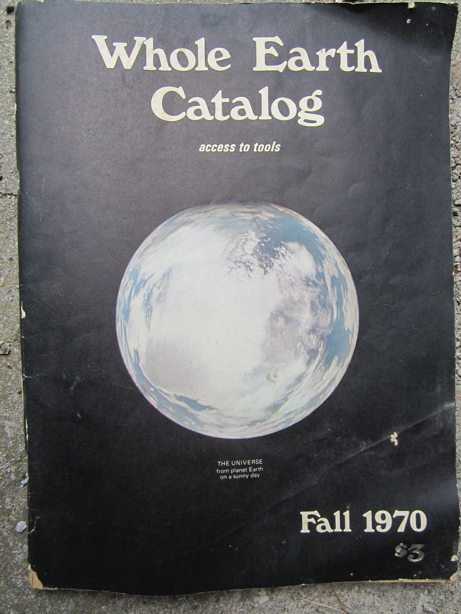
The most striking thing about the cover of the last Whole Earth Catalog, published in 1971, is not the photo of the Earth, all black except for a
silver of milky white and navy blue, but the huge, looming typeface that announces the journal’s name. The lowercase A leans to the left like one might recline in a chair. The upper-case C is rounded like an inner tube floating in an empty swimming pool. The typeset is warm, analog, brimming with AM-radio gold. It looks like it was drawn by a human hand. It is naturalistic, organic. Have you seen it before? Does it look familiar? Its name is Windsor.
Windsor’s appearance on the cover of The Whole Earth Catalog is probably the font’s most famous appearance—the catalog, a phone book-sized almanac represented a certain kind of midcentury idealism rooted in the desire to live off the land, maybe terraform other planets, and at least reconnect with our own. With a few changes, this way of looking at the world is back in fashion. And so is Windsor.
Windsor on the cover of the Fall 1970 Whole Earth Catalog.
Glenn Smith / Getty ImagesIn the last two years, the font has saturated the market, appearing on everything: indie rock record covers, podcast art, bootleg t-shirts, beer cans, cold brew cans, gig posters. You name it. That sexy little lowercase “a” is all over the place. I first became aware of Windsor while on one of my little quarantine walks, catching it in the cover art of the podcast How Long Gone. When I asked Jason Stewart, one of the podcast’s cohosts, about the font choice, he gave a muted response. “It just ended up looking good,” says Stewart, “It’s just so inoffensive to anyone and everyone.”
But Windsor evokes a stronger response in plenty of folks. Once I noticed Windsor in one place, I began to see it literally everywhere, like on the covers of countless of albums: Thom Yorke’s Anima, Helado Negro’s This is How You Smile, Bedouine’s Bird Songs of a Killjoy. I found out that that Bedouine record was designed by an artist named Robert Beatty, who lives in Lexington, Kentucky, and has also made record covers for musicians like Oneohtrix Point Never, Tame Impala, and Kesha. To Beatty, Windsor is like reverb, the effect that makes guitars sound cavernous and washed out. It’s overused, it’s a little obvious, but sometimes you just need to use it. It makes sense. To be clear, Beatty likes Windsor, despite its overwhelming ubiquity. He’s noticed that it’s being used quite a bit in bootleg t-shirt communities.

