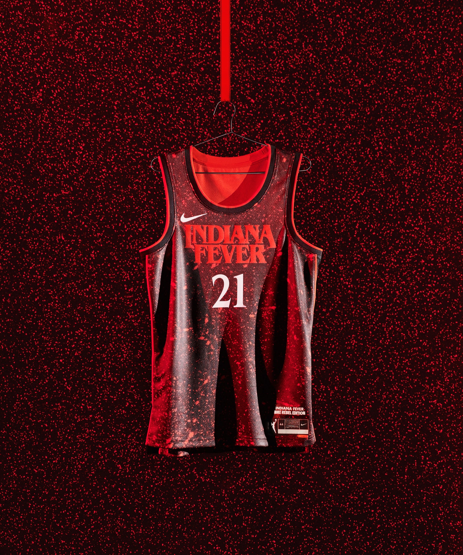
The Indiana Fever are heading to Hawkins.
Courtesy of Nike / WNBAYes, it’s a commercial jersey release, designed
to make money for a company that isn’t exactly providing clear answers about the state of its labor force in China. But the launch comes at a critical moment for the WNBA, which has remade itself as a social platform for its players as well as an increasingly competitive circuit demanding more mainstream coverage and analysis.
Attention aside, the aesthetic explosion tracks to a timeline where the consumption of pro sports is changing. Because of the COVID pandemic, fans couldn’t be in the stands—or in the concourses buying stuff. That cranked up the pressure on the sport as a digital product, both in America and overseas, in the form of TV rights, but also emerging digital markets like NBA Topshot. Jerseys are a piece of that, too. Say what you will about the two-tone pastel popsicle eyebleed that the Miami Heat currently wear during virtually every national broadcast game—it looks insane on TV. For all of the overblown griping about the WNBA's ratings and profitability relative to the NBA, any sport’s not-so-secret-sauce has always been attracting casual fans who don't have hard-set habits or team affiliations. A completely reinvigorated on-court look could go a long way for fans that are only tuning in to some games, or mostly following along on social media.
If you want proof that jersey diversification is an effective marketing strategy, look no further than Major League Baseball, an organization that will not make a major change unless it absolutely has to: A few weeks ago, Nike unveiled a yellow-and-pale-blue Boston Red Sox alternate jersey that noticeably did not include a stitch of red. While this development felt sacrilege to some, it was neck-snapping to many casual fans who otherwise might not have cared about a Boston Red Sox news item. The jersey is inspired by Boston’s Patriot Day, and dressed with the Boston Marathon’s traditional colors; six other teams in big markets (Arizona, both Chicago clubs, Miami, San Francisco and Los Angeles) will unveil “City Connect” uniform editions later this season. After unpacking the influence, the yellow-and-blue numbers feel a little on-the-nose, but it’s certainly the right idea. If something like the Boston Red Sox “City Connect” alternate passes whatever MLB and Nike’s success metric is, we’ll definitely see more experimentation with baseball, which is desperately in search of ways to connect to younger audiences. (Now … bring back “Turn Ahead the Clock”). The people who make baseball are all in agreement that baseball needs to be a better TV product, above all else; modernizing the on-field look would be a great start.
To be clear, there’s a hard ceiling here when it comes to the impact of alternate jerseys as products; these designs are the result of vigorous groupthink, the songs of 1000 email ccs and copious marketing notes. Anything higher than “eight out of ten” is a pipe dream. At the heart of it, a new apparel launch is engineered to move product; a hardcore fan or jersey collector probably already has a home/away set for their favorite team, and any alternate jersey release is an attempt to narrow the distance between the team and the fan’s wallet. This is world soccer’s tried and true strategy, where teams dump brand new, differentiated shirts on fans annually, if not bi-annually.

